Search This Pile of Ash

Sunday, September 2, 2018

Reaching into my Inner Mignola-clone and Other Things

I got my order for an Ames Lettering Guide, it's from Alvin (the brand and not some person named Alvin). I've been wanting this for awhile now, now that I do have it I absolutely love it.

I dove in and set it to the often quoted 3 1/2 setting from Todd Klein's blog, letterer extraordinaire, and I got somewhat confused.... Do you see what I see?

The paper, as you can see, is standard US Letter size. The setting Todd Klein uses is quite small, very much proportional to the general measurement of the very same lettering on reproduced art, that is the final product that you see in floppies, in trade paperbacks, in omnibuses, and other sorts of comics. Thus, the setting that Todd Klein says that you should use matches the size for the art once scaled down since the reproduced art is half the size or less of that which you see in what is offered to the usual comic book reading public, those who buy original art aside. Once scaled up to the usual size that the original art has, that is around 10X15", 11X17, or A3, to be proportional the lettering setting should also be scaled up to at least the 7 setting. Reproduced art is just half of that or less than that. Anyway, with this realization which might not even be true at all and I'm just going off on some weird logic, I set my own Lettering Guide to 8 and played around with 6 and went off with that. here's how it went. (I remember seeing some letterers working on reproduced art and Klein working on overlays over the original art, so I don't really know. It might just be something particular to the letterer and there isn't a set standard.)


Most of these are with the 3 1/2 setting.

Also, here's some doodles.


These were in the last couple days.

Some sketches.
Me calling on my inner Mike Mignola.

Sunday, August 26, 2018

Small Update on the Public Domain Book Project

I'm around two-thirds of the way done adapting the book I've been dealing with lately, adapting it to a comics format from its prosaic origins. It currently stands at twenty-one pages so far, including the small segment of the last section that is yet to be adapted. My estimates of it reaching thirty-one to thirty-three pages long is still true and strong. This is only with the first chapter though, I don't particularly plan on drawing the rest of the book as I think of this project as more of an exercise in how well I can adapt things from one medium to another and honing my storytelling abilities as an illustrator within the Comics-bande-dessine, or the Ninth Art as it is sometimes called, tradition of the Fine Arts.

An interesting thing to note is how my paneling style has changed with my adoption of a new technique*. There was a constant appearance of these styles of comics paneling, in part or in whole:

  
2X3
3X3
There was also a significant presence of a Howard Chaykin-esque panel style, I could not find any passable examples online so this sketch by myself must do to make the point.

It's a mix between the 3X3 and 2X3 panel styles in the number of panels per row, the rows themselves coming closer to the 2X2 panel style. One of my favorites was the mix of the 2X2 + one row from the 3X3, becoming much like what you see just above this paragraph but with another set of the two panels.

Intersped in all this I also have those little panels within panels that Mike Mignola and Howard Chaykin use so well and interestingly.

It's just interesting to see this constant pattern appearing in the thumbnails of the comics adaptation.

*Said technique being similar to Chester Brown's technique. I would draw each individual panel as its own entity before arranging them in pages, but my own technique is different from Brown's in that I still punctuate things by beats and significant events that I feel could mark the end of a page/ the start of a new page. Chester Brown, from what I know, just draws each panel as he writes and only arranges them into pages once done drawing them all.

Sunday, August 19, 2018

Perspective and depth

Nothing much this week, I've been reading Norling's Perspective Made Easy (again*). In one of the final panels of Dart With Destiny, the panel I was redrawing was a perfect opportunity to utilize perspective and the elements which were already there weren't going to be changed too much in order to accommodate it. It was fortunate to say the least. Thinking in perspective again was fun, not just focusing on the arrangement and foreshortening of characters to offer a feel of depth.

Grinding boxes
 Have a sketch.

*I say again as I read around a third of it in the past but forgot all about it. I've been fixing that.

Saturday, August 11, 2018

Public Domain, I Thank Thee

So, the one project that I've set aside years ago is back on again. The book is apparently on public domain, I had verified it mainly by searching said book on Gutenberg and Librivox, two book services that offer public domain books with the latter offering community-made audiobooks.

Updates when they come.

Realizations and Reflections Thanks to Figure-Drawing

A lot of studies lately, mainly in improving my realism, my gestures, my drapery, and experiments in my inking. I've learned a lot in this time, I hope you would see what I've learned too.


Nothing really interesting here but it's something I've drawn and from what you can see here, I've still got a long way to go with making my drapery buttery, smooth, and technically correct. I just slapped them on without thinking too much about forming it around the figure. I should fix that.

 These ones were semiserious studies where I tried to study gesture in particular. 

My inking here is quite poor. Sadly I didn't get a picture of the pencils but they were so much better. I need to reform my inking, I was too quick and not careful here, the careful linework I've worked into with the pencils was lost in the spirit of the moment. I've even fucked up the anatomical details for crying out loud. Oh well, it's a learning moment. 


Some gesture and drapery studies where I did a lot better. I played with markers and brush liking here, it was really fun.

Sunday, August 5, 2018

Preparing to Finish "Dart with Destiny"

Dart with Destiny is a comic I'm doing with a friend. I'm playing around with it now, final edits and fixes.

Greater contrast or the lack thereof, etc.

300dpi, no contrast

300dpi with contrast
600dpi, no contrast

600dpi, with contrast


Sunday, July 29, 2018

A Look towards Texturing

A need to hone my ability to draw backgrounds again had come over me. After a good synthesis, or the return to my previous skill with regard to that, of the figures on the page and the backgrounds, I plan to return to my perspective studies. It's sad... at one point in time I was fairly decent with one-point perspective, mediocre with two-point perspective, and have tried attempts at three-point perspective with a small amount of success. Ach well... I'll eventually return to that point. For now... I hone what I can do now.

Sketches coming now:


A cropped version of the full drawing below. I think it works well enough... if with too much usage of black. Ah... such is my recent pouring over of Mignola and his inky darkness that he is known for.
The full drawing.

Some wood texture studies. Close-ups below.


Sunday, July 22, 2018

Some Things I've Been up to Lately a.k.a Other projects

The Chronicles of the Late Great Timothy Dexter, Felosofer Extraordinaire! or A Few Pickles More for the Knowing and now Seeing Ones (Tentative Title) with myself as artist and writer both

One day, in one of my frequent (or daily to be honest with myself) excursions into the wild world of the internet, I came across this glorious man. I want to draw this man's life, at least as far as I am able to based on the various documents I've already found on him the primary evidences of life in that late 18th century and early 19th century America period Lord Timothy Dexter lived.

The Great Lord and Felosofer himself.
Why do I want to do this? I can't say why. All I know is that I must do it, even if it takes some time. It shall happen.

Some of the sketches and the like that I've made so far.


To be true, I have other projects where I'm the writer or the scripter, assuming I'm adapting a work into a comic, and the artist both but these two projects are the ones that I have had the most recent progress in. One of them even has a first draft of the script done already. Soon. Soon.

References:
https://pbs.twimg.com/profile_images/1324303464/Timothy_Dexter_400x400.jpg

A Growing Capability in my Figure Exercises and Inking Blues

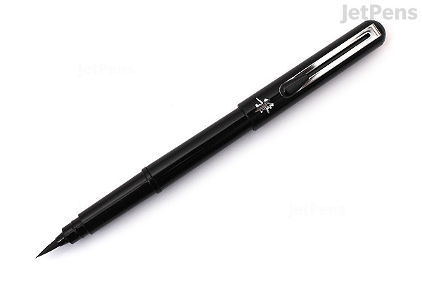
Not what I'm actually using but it's a good enough facsimile,
I should think.
Good news,

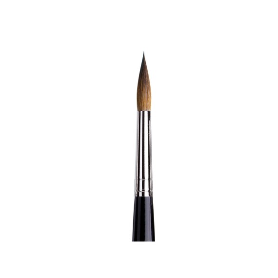
I've found a new play thing to make art with. Not really new, to be true, but new it's new in that I see them with a new light. A light of excitement and desire that I had not seen in a long time in dealing with art materials. I'm speaking of... brushes. Simple ass brushes. Chinese brushes, to be exact. The kind that isn't like our beloved Pentel Pocket Brush Pens, nor our Kolinsky or Sables that cost a good deal, at least in comparison to some Chinese brushes (so you get what I'm talking about, a PPBP or good sables costs around $16 for the most part online in American stores and $20-25 in local stores, online and retail, in the Philippines WHILE Chinese brushes can go for as low as $0.25...).


 This is where the BAD news comes in. I've been wasting my time with these beautiful brushes, very good brushes. None offer the interplay of sensitivity, price, and sharpness that I seek, that was until I (re)found my Chinese brushes.

Bored and stuck in my room due to heavy rains, I took up my old bottles of ink and just played around with them for a few hours. Oh those brushes were wonderful after some frustration with my pen nibs which refused to work. The brushes were consistently offering what I've long
been searching for while making do well enough with my usual kit of Pentel Pocket Brush Pen, Pentel Waterbrush (with its bristles swapped out for the Kuretake Waterbrush bristles and filled with a concentrated form of Higgins Carbon Black), Da Vinci Maestro, and my Staedtler Pigment Liner.

With these Chinese brushes I can also lay claim to the idea that I'm following in the footsteps of the legendary Philippine artists like Nestor Redondo, Alfredo Alcala, and the like who too used a Chinese-style brush in their own renowned illustrations and comics work. Ah... one day I'll draw like them. One day....


Note the Chinese brush in the hands of the great Redondo.
Some of the drawings that I've sketched lately and then inked. They came about from my usual morning figure drawing exercises which started to show their returns, at least according to some people in the art and comics discords that I hang out in sometimes.

So that you, the hypothetical reader, might have at least some kind of a comparison, these are purely graphite and figure drawing, no inking.


I really like these ones for some reason. It's probably because I really feel the Mignola in these sketches.


_____________________________________________________________________________

The PPBP+Waterbrush with ink sketches


 _____________________________________________________________________________
Chinese brush inks

Credits to Line of Action and Quickposes for the reservoir of images that these were sketched from.
I'm still new to the entire field of Chinese brush-constrained inking. Might be awhile to get used to but I should think it'd be worth it.

That's all for now. Thanks for reading, whoever you might be.

Sources:
https://img-new.cgtrader.com/items/186591/6d5cde7b3d/chinese-calligraphy-brush-pen-3d-model-max-obj-fbx-c4d-ma-mb.jpg

https://static2.jetpens.com/images/a/000/106/106220.jpg?mark64=aHR0cDovL3d3dy5qZXRwZW5zLmNvbS9pbWFnZXMvYXNzZXRzL3dhdGVybWFyay5wbmc&markalign64=dG9wLHJpZ2h0&markscale=19&q=90&s=3942bfcd93e57a6fd5ed35393e59febd

https://img0.etsystatic.com/055/0/9672239/il_570xN.729315700_luza.jpg

https://upload.wikimedia.org/wikipedia/commons/thumb/c/c2/Nestor_Redondo_%281118250566%29.jpg/1024px-Nestor_Redondo_%281118250566%29.jpg


Sunday, July 15, 2018

Dart with Destiny Tenth (and Last) Page

Dart with Destiny with Deftbeck (writer) and myself (the artist)

After much time, I've finally done it. I finally finished this comic that I've been working on for awhile now with Deftbeck. I forgot when I started but it's been at least one academic year and a couple months at the very least but damn it, it's finally done. I can move on to other projects now, which I've actually kinda started. In all honesty, I'm not done with Deft's thing. I still have to redo a few panels that are too off or update the style deviation to the later pages or even out the style of the comic with the first few pages. Yet, that is all secondary for the illustration proper is done. That's the important bit.

The tenth and final page. Note the heavy usage of opaque white ink. My backgrounds have also degraded. Where I once had a decent grasp of single-point perspective and two-point perspective, I'm barely even managing to do flat, 2D backgrounds. Mignola was, of course, my muse and my rescue.

Friday, July 6, 2018

Hot Boss Sitcom has its First Piece of Fanart

I did a small sketch for someone with a fantastic new concept from a Discord
server I frequent. He asked for a link he can link the credit to and so I gave him the link to this place, as dead as it is due to my final semesters in university killing much of my free time. That little prod of his brought this place back to my attention and... well... it does seem appropriate to come back here and give it the attention it needs again. Now on to the art.


Corey Thompson, the other main character of the Hot Boss Sitcom tumblr project
The blog where I based this little sketch off of and where the stories will likely go